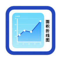
Area Line Chart Generator
Create area line charts online, with data import, real-time preview, diverse customization, and high-quality export
Browser execution mode: Your data is processed in your browser and is not uploaded to the server.
Speed and Stability: Processing speed depends on your device and browser. For large batch work, the desktop version may be more stable.
Loading tool, please wait...
If the online tool fails to load or run, try the desktop tool.https://tools.yikeaigc.com/
Tool Usage
Return to old versionSet up first: Confirm data and chart settings first, then generate a preview and export. CSV/Excel files are parsed only on this page.
Try the sample data first, then replace it with your own.
1Choose data source
First column is the X-axis; following columns are area series.
One per line, or comma-separated.
Data series
First row can be headers; first column becomes X-axis labels.
2Chart Settings
3Size & Display
4Data preview
Only the first 10 rows are shown for checking.
After setting data and styles, go to preview and export.
1Generate & Download
2Batch file processing
If multiple CSV/Excel files are imported, a chart can be generated for each file and downloaded as a ZIP. Output filenames match the original filenames; duplicates get numbers automatically.
You can also use the button in the preview area on the right to download a single chart.
Instructions
Software Usage Instructions
- Select a data source:You can use manual input, paste a table, import a CSV/Excel file, or load sample data. The first column is used as the X-axis labels, and the subsequent columns are used as area chart data series.
- Edit data series:In manual input mode, you can set the name, color, and values for each series. Click “Add Series” to add multiple area curves.
- Set the chart type:
- Standard area line chart:Each series is drawn from the baseline, suitable for showing single or multiple trends.
- Stacked area chart:Multiple series are displayed cumulatively by value, suitable for observing changes in totals and composition.
- Percentage stacked area chart:Displays proportions at each time point, suitable for showing changes in structural proportions.
- Adjust style settings:You can set the title, subtitle, axis names, line shape, color theme, fill opacity, chart size, label angle, line width, data point size, decimal places, gridlines, legend, value labels, and watermark.
- Generate the chart:After completing the data and style settings, go to the “Preview Export” page and click “Generate/Update Chart” to view the result.
- Export files:A single chart can be downloaded in PNG, JPG, SVG, PDF, HTML, JSON, and CSV formats; when importing multiple files, charts can be generated in batches and packaged as a ZIP download.
- Save settings:Click “Save Settings” to keep the current chart parameters, which can later be restored using “Load Settings”.
FAQ
A: An area chart adds filled regions to a line chart, making it better suited for expressing trend changes, data scale, and composition relationships between different series; a line chart emphasizes the line trend itself.
A: A standard area chart is suitable for showing the independent trends of each series; a stacked area chart is suitable for showing the total and the contribution of each part; a percentage stacked area chart converts each time point into a 100% proportion, making it suitable for comparing changes in structural proportions.
A: It is recommended that the first row be the header and the first column be the X-axis labels, such as dates, months, or categories; the second column and subsequent columns should be numeric series. CSV, XLSX, and XLS files can all be used.
A: Check whether the number of X-axis labels matches the number of values in each series. If the counts differ, the tool will plot based on the shorter matching length. Empty values or unrecognized content will not be displayed as valid values.
A: Use a 100% stacked area chart when you need to observe changes in the proportions of multiple categories across different time points. Examples include product share, channel share, budget structure, and changes in energy mix.
A: Batch export generates the corresponding chart using the original file name. If multiple files have the same name, the system automatically adds a number after the file name to avoid overwriting results.
A: PNG is suitable for preserving sharp edges and transparent backgrounds; JPG is suitable for smaller image file sizes; SVG is suitable for later editing and vector layout; PDF is suitable for report archiving, printing, and sharing.
Related Tools
Online Step Line Chart Generator
Professional step line chart maker with support for data ...
Animated Bar Chart Race Generator
Generate animated bar chart races online, with JSON/CSV/E...