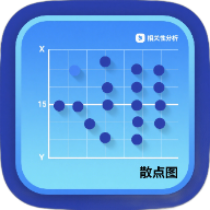
Online Scatter Plot Generator
Professional online scatter plot maker with data import, trend line analysis, and multi-format export, making data visualization easy
Browser execution mode: Your data is processed in your browser and is not uploaded to the server.
Speed and Stability: Processing speed depends on your device and browser. For large batch work, the desktop version may be more stable.
Loading tool, please wait...
If the online tool fails to load or run, try the desktop tool.https://tools.yikeaigc.com/
Tool Usage
Return to old version
Prepare data, set chart options, then generate and export the result.
1Data source
2Paste or enter coordinate data
Supports comma, Tab, semicolon, pipe, or space separators; first two columns are X and Y, optional 3rd label and 4th group.
2Enter X-axis and Y-axis separately
2Import data file
Select multiple files at once; only the first 20 are shown, but batch processing handles all files.
3Data preview
Data points-
X range-
Y range-
Correlation coefficient-
Linear R²-
Skipped rows-
| # | X | Y | Label | Group |
|---|---|---|---|---|
| Waiting for data | ||||
Go to style settings after data check.
1Chart Text & Size
2Axes & Trend Analysis
3Colors & Point Style
Generate the scatter plot after setup.
1Generate & Export
After generating, download PNG, JPG, SVG, or a data summary.
Instructions
Software Usage Instructions
- Select a data source:At the top of the tool, choose coordinate pair input, X/Y column input, or file import. Coordinate pair input is suitable for copying X and Y data from a table, while column input is suitable for two separately prepared sets of values.
- Prepare data content:
- Coordinate pair input:Enter one set of X and Y values per line. You can also add labels and groups, for example: X,Y,label,group.
- X/Y column input:The X-axis and Y-axis each have one text box, with one value per line. The number of values in the two columns must match.
- File import:Supports CSV, TXT, and JSON data files. You can select multiple files at once for batch generation.
- Check data preview:After entering data, the tool displays the number of data points, X/Y ranges, correlation coefficient, linear R², and the first 20 rows of data, making it easy to confirm whether the data was parsed correctly.
- Set chart parameters:Go to the style settings page to enter the chart title, X-axis label, and Y-axis label, and set the export width and height, font, font size, coordinate range, and coordinate padding.
- Configure trendlines and styles:
- Trendline:You can choose linear regression, quadratic polynomial, cubic polynomial, exponential regression, or logarithmic regression.
- Statistics:You can display the regression equation and R² to help assess the data fit.
- Point style:You can set point color, opacity, size, shape, grid color, and background color.
- Display options:You can control the display of grid lines, legends, and data labels.
- Save settings:Click “Save Settings” to keep commonly used chart parameters, so you can apply them directly when creating similar charts later.
- Generate and download:After clicking “Generate Scatter Plot,” you can download a PNG, JPG, SVG, or CSV analysis summary. After batch file processing is complete, you can download a ZIP archive containing all results.
FAQ
A: Manual coordinate pair input, X/Y column input, and CSV, TXT, and JSON file imports are supported. For CSV and TXT, two numeric columns are recommended, with the first two columns used as X and Y values respectively. You can also add a label column.
A: Linear regression is suitable for relationships that are approximately straight lines; quadratic or cubic polynomials are suitable for data with curved changes; exponential regression is suitable for data that grows proportionally; logarithmic regression is suitable for data that changes quickly at first and then levels off.
A: The correlation coefficient indicates the direction and strength of the linear relationship between two variables, usually ranging from -1 to 1; R² indicates how well the trend model explains changes in the data. The closer the value is to 1, the better the fit usually is.
A: Common causes include empty cells, non-numeric characters, inconsistent delimiters, or incorrect X-column and Y-column position settings. Check the number of skipped rows in the data preview, and adjust the column numbers or the raw data format.
A: Batch generation exports charts using the original data file names. If duplicate file names are encountered, the system appends a number to the file name to distinguish them, and packages all results into a ZIP file for download.
A: PNG is suitable for reports and presentations, with clear image quality; JPG is suitable for controlling file size; SVG is a vector format, suitable for later editing in design software or for chart scenarios that require scaling.
A: A scatter plot is suitable for showing the relationship between two continuous variables, such as ad spend and conversions, temperature and sales, height and weight, experimental dose and response value, and can also be used to observe distribution patterns, outliers, and group differences.
Related Tools
Animated Bar Chart Race Generator
Generate animated bar chart races online, with JSON/CSV/E...